
How two web programmers at UW-Madison redeveloped an interactive campus map based on past lessons learned and new requirements.
Online, interactive campus maps are sometimes characterized in online press as a bellwether of progressive mapping practice, balancing an artistic aesthetic in presenting the campus with a demonstration of innovative approaches to mapping geared toward a decidedly younger, more mobile and often technically-savvy target audience.[1] So when we heard that work was progressing on a new version of the University of Wisconsin – Madison campus map, we were curious to find out more. While there will undoubtedly be standard publicity now that the map has been rolled out, we were equally or more interested in the technical choices behind the scenes. Recently, we visited Nick Weaver and Bryan Shelton of the University Communications Office to explore the drivers, objectives and technical approach they employed for this new project.
A Little Background
The UW-Madison campus map – in both print and online format (http://map.wisc.edu/) – has been a longstanding, well-used feature of campus life. From its earliest iterations, the Campus Map was produced by the Department of Geography’s Cartographic Laboratory in conjunction with stakeholder campus units who managed the project requirements.
To the credit of the Cart Lab (its familiar name on campus) and the esteemed tradition of cartographic education in the Geography Department, the UW Campus Map has long been an award-winning product. The printed map has won multiple notable awards over the years for its innovative print quality including “Best Reference Map” in 2006 by the American Congress on Survey and Mapping[2]. More recently the current online interactive map released in 2007 was recognized by the North American Cartographic Information Society (NACIS) with an Honorable Mention Interactive Mapping Award and received the University of Wisconsin Vice Chancellor for Administration’s Best Practice Award. To our mind, this creates high expectations for a follow-up product.
Diffusion of Technology
A notable difference in exploring the approach to our next-generation campus map is, in contrast to all previous versions, this online map is being produced by the University Communications Office, with consultation and advice from the Cart Lab and other campus partners. To us, this represents a visible example of the diffusion of online web mapping technology and developer capability. Now, seasoned web developers are able to embrace available technology and, with consultation and key advice on certain geospatial concepts and cartographic design principles, implement that technology to achieve their spatial and non-spatial objectives. There were also budget realities in taking this approach. What we found particularly refreshing in this scenario was the openness and interest in collaboration bringing refined skill sets in cartography and application development together on the project.
Objectives (via lessons learned)
When we first sat down with Nick and Bryan, it became immediately clear that they were no strangers to the functionality, utility and (perhaps most importantly) level of effort required to keep the current online campus map up to date. In fact, two of the primary drivers they noted for updating the current online campus map were: level of ease in updating the map; and adopting mobile-friendly interface architecture. They further elaborated that when they first began, they had fully expected to go down the road of a highly-customized Google Maps API-based architecture based on interim experience with simpler applications of these technologies. Once Bryan began researching alternative open-source solutions, they quickly realized the options were numerous.
The Approach – full steam ahead
While doing research, the duo encountered a rich set of libraries available for custom web map development and deployment. A few packages in particular piqued their interest for their ability to easily surpass or overcome perceived obstacles in using a pure Google Maps API-based approach.
In particular, as they educated themselves on the nature of their options, Nick and Bryan decided, among other things, that they wanted to be able to stage and deliver their own map tiles at multiple scales. In addition, they desired a flexible, scriptable styling language for map features as well. After running some rudimentary experiments, a natural web mapping ecosystem of tools started to emerge:
- OpenStreetMap (OSM) – for bulk initial base map content;
- PostGIS – scalable spatial database for staging OSM content with enhancements;
- TileMill/MapBox – scalable tile server for rendering and optimizing delivery of map tiles with TileMill as the open map tile design studio client;
- Leaflet – lightweight Javascript interface development library with mobile compatibility.
In taking a more in-depth look at these choices, it’s typical to start with the base map content. The development team was surprised when they investigated the possibility of using OpenStreetMap (OSM) data as a starting point. “Madison had a wealth of OSM feature detail already present.” This made the job of fleshing out detail and adding must-have map content on top less daunting, but the team also knew this would be a big step. It wasn’t a fully-custom base nor was it Google Maps, with which so many casual users are accustomed. They presented the OSM database to one of their primary on-campus content partners, who no doubt showed some skepticism toward a crowd-sourced database of map features. In the end, the same partner showed a keen interest in, and saw the value of, becoming the localized steward of “our piece” of the OSM view of the world. Nonetheless, content control and ease of revision were still high priorities.
So, the team investigated methods for off-loading campus-wide OSM data into a staging database for publishing control and advanced styling options. They did use the online OpenStreetMap database as their “master” database submitting authoritative edits for all to utilize, with periodic downloads and feature comparison to the existing published map. PostGIS, the spatial extension for the popular PostgreSQL database, turned out to be an optimal choice for spatial storage of the staging database. This choice provided for direct SQL and scripting interfaces for editing and master database comparison.
Next they tackled the desire to author styled, cached map tiles for high performance in map rendering. Enter Development Seed’s MapBox software for tile generation with custom styling ability utilizing a hybrid ‘CartoCSS’ language via the TileMill design studio. This allowed Bryan and Nick to adjust the template tiles to their liking and optimize them for this project.
To bring all these foundational technologies together, Leaflet.js was used for interface development. Similar to OpenLayers or the Google Maps API, Leaflet is a Javascript API mapping library that renders map features and allows the developer to add various tiled layers and interactions. In a user environment heavily reliant on cellular data connections, it is important to keep the application as lightweight as possible while attempting to ensure device independence. Leaflet is only 27KB, and built to leverage the HTML5 and CSS3 capabilities of modern desktop and mobile browsers which makes it a forward-looking choice for a project such as the UW campus map.
What to Expect
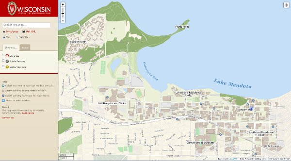
The departure from both the current Flash-based campus map and the mobile Google Maps-based version gives the new campus map a unique look. Based on the Mapbox OSM Bright styling template, the map will resemble the Google Maps road basemap that so many users are accustomed to navigating, yet will include custom styling cues unique to the project. Perhaps the most significant impact of the new mapping platform is the unification of the desktop and mobile experience. Instead of learning to interact with two divergent platforms depending on the device, the new map will be platform independent and provide a similar experience regardless of device. The flexibility of this new platform also allows for integration with other map-based services, such as the bus-finding functionality of the Mobile UW App. Although this will not be used extensively when the map is released, look for additional integration with other campus services in the future, especially specific-purpose maps based on the UW base map.
Collaboration for Success
The new map launched last week. While the initial launch was a major milestone, Bryan and Nick look forward to getting user feedback and more input from the GIS and cartography communities on campus so that they can continue to improve the overall user experience. In particular, they hope to find ways to improve the base layer tiles’ representation of the campus and want to make the user interaction with the map as intuitive and rewarding an experience as possible.
[1] Thrift, Nigel . “Maps of Universities” Chronicle of Higher Education. 27 June 2012. Chronicle of Higher Education. 28 Sept. 2012 <http://chronicle.com/blogs/worldwise/maps-of-universities/29935>.
[2] “New campus map leads straight to top honors” , UW-Madison News. 4 April, 2006. <http://www.news.wisc.edu/12383>.