
I want to look under the hood!
– Ad for 1970s board game “Dealer’s Choice”
Areal interpolation is a GIS process in which an attribute from one set of polygons is transferred to another set of polygons based on the area of intersection. A common application of areal interpolation is to transfer population statistics tabulated for census zones (such as tracts or block groups) to other zones (such as zoning districts or flood zones) not tabulated by the census.
Consider the map on page 15 of the Ozaukee County 2035 Comprehensive Plan. This map shows the population density by PLSS (Public Land Survey System) quarter section. The map depicts the distribution of rural population better than census tract maps do, since tracts can be large in rural areas. But how do we construct such a map?
Areal interpolation has been around for a long time. The classic statement of the problem and its solution can be found in Goodchild and Lam’s 1980 paper, Areal Interpolation: A Variant of the Traditional Spatial Problem. The basic idea is simple. For population data, start with two layers: source zones (like census tracts) that have population data; and target zones (such as PLSS quarter sections) that you want the populations transferred to. Intersect the two layers to create polygon “fragments” and for each fragment, allocate the population of the fragment’s overlapping source zone weighted by the proportion of the area of the source zone that the fragment occupies. Finally, sum the allocated population values for the fragments for each target zone.
This approach assumes that population is uniformly distributed over space, such that it can be accurately transferred to the target zones based on area proportions alone. Another technique, called dasymetric mapping, is sometimes used when it is known that this assumption is false. The word dasymetric comes from Greek and means density measurement. The basic idea is to only allocate population where people actually live. Areas like lakes, roads and agricultural fields should be excluded from the allocation process.
There are many variants of dasymetric mapping, from simple methods where such non-population areas are simply masked, to statistical approaches involving regression analysis. But in all variants, the objective is the same – to allocate population in a way that accounts for its non-uniformity over space.
An Example
In this post, I’m going to run through a simple demonstration of areal interpolation and dasymetric mapping. I’ll use Ozaukee County as a test case, showing how you can apply these methods to transfer census tract population to PLSS sections.
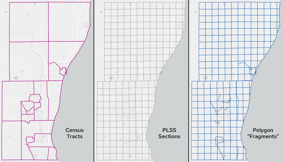
Ozaukee County tracts, sections and the resulting polygon “fragments”
I will also employ the method of areal interpolation advocated by Esri for ArcGIS Pro, which is based on a completely different approach involving geostatistical modeling (kriging). Kriging was developed by geologists to model phenomena that exhibit spatial autocorrelation – the idea that locations that are close together tend to have similar values. In Esri’s areal interpolation method, a geostatistical population surface is generated from the source-zone centroids, and then the values on the surface are allocated to the target zones.
In this post, I’ll compare the results of the three methods – areal interpolation, dasymetric mapping and geostatistical modeling – both visually and statically.
An important consideration in interpolation – whatever method is used – is the property we’ll call plithyphylacticity. This word, from Greek, means population preservation. It means that our interpolated populations should sum to the same total as the source zones. We don’t want to gain or lose people when we do the interpolation. We just want people to be redistributed from the source zones to the target zones. We’ll see whether the three methods conform to this property.
For this example, I obtained census tract data with 2020 populations for Ozaukee County from the US Census Bureau. I obtained PLSS sections from the Statewide Parcel Project.
An important first step in any type of areal interpolation is to PROJECT your layers to an equal-area projection, to ensure that area proportions are computed correctly. I used the Albers Equal-Area Conic projection modified so that the principal meridian runs through the center of Ozaukee County. WTM (Wisconsin Transverse Mercator), UTM (Universal Transverse Mercator), Wisconsin State Plane Coordinate System zones and Wisconsin County Coordinate Systems are not based on equal-area projections, so using them without reprojecting first should be avoided.
When computing areas of polygon fragments, source zones and target zones in the procedure that follows, you can also use the geodesic option in ArcGIS to make doubly sure that your area computations are not affected by the wrong projection.
Method 1. Areal Interpolation
The steps in areal interpolation in ArcGIS are as follows.
- Run INTERSECT on the census tract and sections layers to create a polygon fragments layer. In my data, the tracts layer has an attribute called POP holding values for the 2020 population of each tract.
- In the resulting fragments layer, create a new attribute called FRAG_AREA and compute Area (geodesic) in square miles.
- Run SUMMARIZE on FRAG_AREA with statistic type SUM and case field equal to the census tract name or ID field. This will create a stand-alone table.
- Join this table to the polygon fragment layer, joining on census tract name or ID. This will append the sum of the areas of all fragments associated with a given census tract to the appropriate record. Let’s call this TRACT_AREA.
- Add a new field (float or double) to the fragment layer called FRAG_POP and calculate it as POP * FRAG_AREA / TRACT_AREA
- Run SUMMARIZE on FRAG_POP with statistic type SUM and case field equal to section name or ID. This creates another stand-alone table with the total interpolated population for each section.
- Join this table to the sections layer (the target zones), joining on section name or ID.
- You can now create population and/or population density maps for the section layer based on the total interpolated population for each section.
Method 2. Dasymetric Mapping
The steps in dasymetric mapping are as follows.
- Create a layer of polygons where people do not live. I used the statewide parcel layer, selecting all parcels with a value of NULL (rights-of-way, etc.) or not having a value of “1” in the property class field, this being the code for “residential.” This is an imperfect approximation of the areas where people do not live, since group quarters (institutions, dorms, etc.) may be coded as something other than residential, but it’s a place to start.
- Use ERASE to remove these areas from the target zones (sections).
- Run INTERSECT on the census tract layer and the sections layer where “no people” areas have been removed. This will create a dasymetric polygon fragments layer (see map below).
- Follow steps 2-8 for the areal interpolation process (above). In steps 7 and 8, use the original sections layer, not the one with “no people” areas removed.
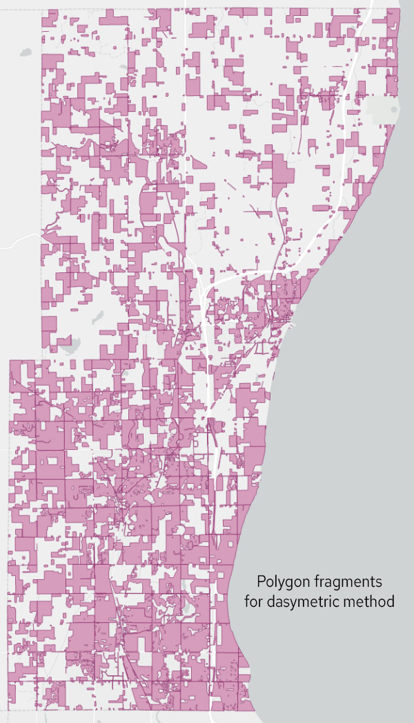
Polygon fragments resulting from the dasymetric method, with “no people” areas removed.
Method 3. Geostatistical Model
Esri’s preferred method for areal interpolation uses the Geostatistical Wizard in the Analysis menu. Note that this method, like areal interpolation (Method 1), does not remove places where people do not live. It assumes every location in the county is valid.
To run the wizard, I followed the steps outlined here. From the options I chose AREAL INTERPOLATION, with TYPE equal to EVENT, the census tract layer as the INPUT, the POP attribute as the COUNT field, and no TIME field. On the resulting covariance graph (see screengrab below) I tweaked the parameters to get a good fit, finally deciding on a LAG SIZE of 1700, NUMBER of LAGS of 10 and a STABLE model.
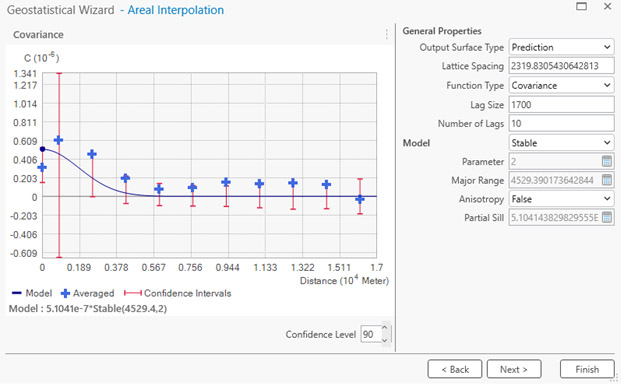
Covariance graph in Geostatistical Wizard
Covariance is a measure of spatial autocorrelation. In ArcGIS, covariance is computed as the mean of the product of the differences between the observed population values and the overall mean population value for all observations separated by a specific spatial lag. The spatial lag is the interval (distance) between observations. (See this page for a deeper dive.) In the Ozaukee County example, if tracts at a given lag have similar population values, whether above or below the mean, the covariance will be a positive number, indicating positive spatial autocorrelation. Typically, we see autocorrelation over short lags. In other words, as cartographer Waldo Tobler famously said, “Near things are more alike than more distant things.”
The covariance graph in ArcGIS shows the covariance over different spatial lags. The NUMBER OF LAGS is the number of lag intervals, each separated by a distance of LAG SIZE. On my graph (above), looking at the blue crosses, you can see that when we get to a lag of 10 (17 km = 10 x 1700 m) the covariance is essentially zero, suggesting it is a good place to stop. Adding more lags is unlikely to help explain the autocorrelation distribution, since the autocorrelation is low at such distances. The highest covariance is for lag 2, indicting that for the Ozaukee County tract population data, autocorrelation peaks at a relatively small distance and then tapers off.
There are a lot of MODEL options in the Wizard, and you can try these to see if they fit your data better than the STABLE model. Leave the OUTPUT SURFACE TYPE set to PREDICTION, the FUNCTION TYPE to COVARIANCE, and ANISOTROPY to FALSE. If your distribution is anisotropic (from the Greek for “unequal direction”) it means the autocorrelation is different in different directions.
The Esri guidance indicates you have a good fit (the model explains the autocorrelation structure of your data adequately) when 90 percent of the blue crosses fall inside the red bars.
After the Wizard creates the statistical surface, use the AREAL INTERPOLATION LAYER TO POLYGONS tool to allocate the surface values to the sections layer. The attribute showing the estimated population of each section will be called PREDICTED.
Visual Comparison
The four maps below show the results of the analysis. The first map shows population density for the original census tracts, and the others show population density for areal interpolation, dasymetric mapping and geostatistical modeling. Unlike the map in the Ozaukee County 2035 Comprehensive Plan, which is based on quarter sections, my map use sections, just to keep the example simple.
, 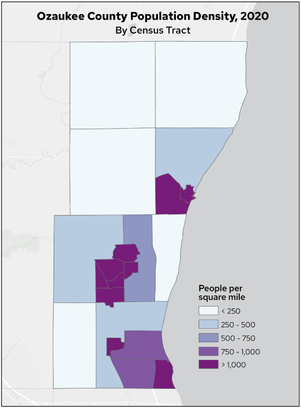
Map 1. Ozaukee County population density, 2020, by census tract
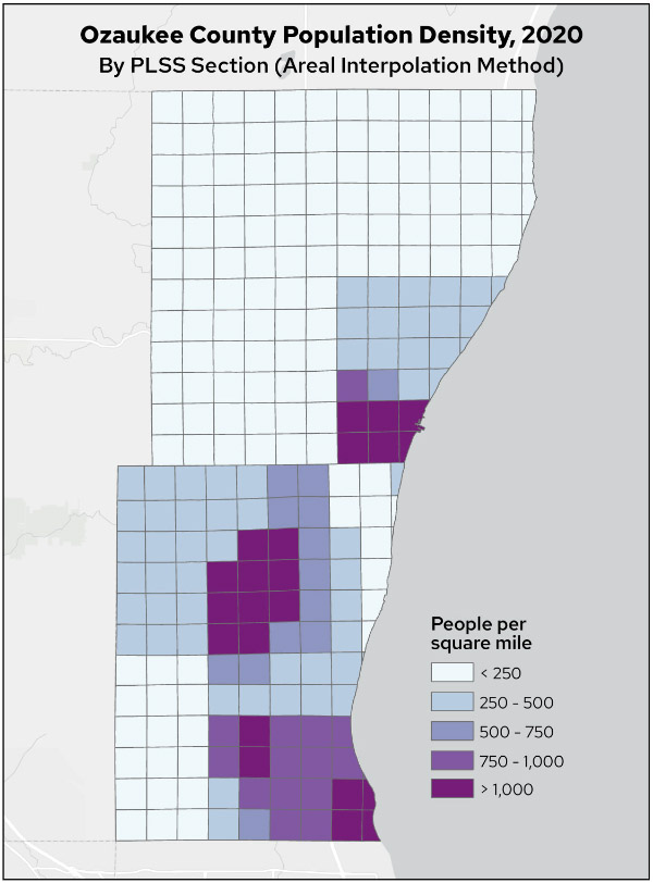
Map 2. Ozaukee County population density, 2020, by PLSS section (areal interpolation method)
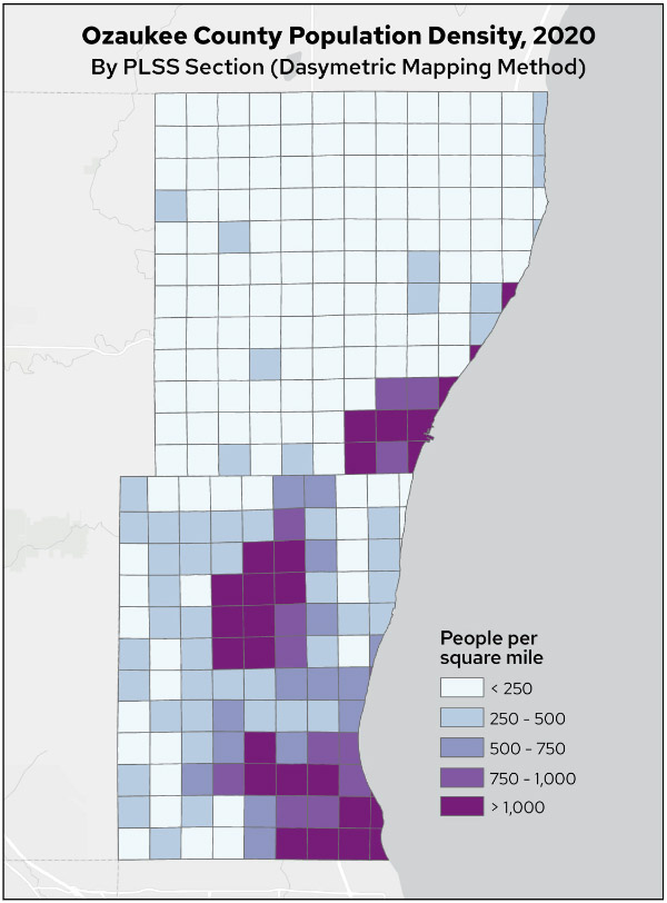
Map 3. Ozaukee County population density, 2020, by PLSS section (dasymetric mapping method)
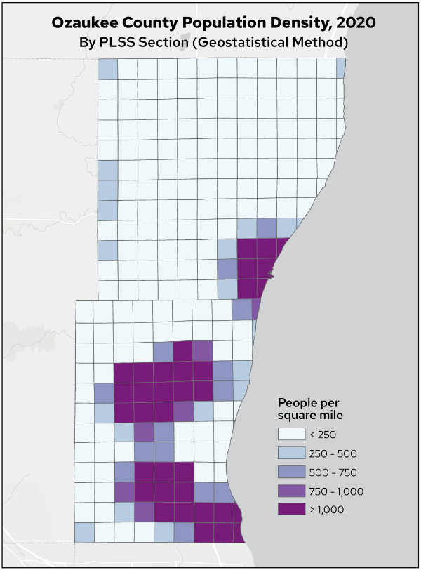
Map 4. Ozaukee County population density, 2020, by PLSS section (geostatistical method)
There are some obvious differences in the resulting population distributions. The areal interpolation method visually matches the census tracts most closely, as might be expected given that this method spreads tract population evenly based on area of intersection.
The dasymetric population density distribution is more nuanced, showing variations in rural areas based on the exclusion of areas where people do not live.
The geostatistical population density distribution is much more clustered, with larger areas of high density and generally lower rural densities.
Statistical Comparison
To quantify the accuracy of the three methods, I used 2020 census block population data. Blocks are much smaller than tracts and are nested hierarchically within them. I used the block layer to assess the accuracy of each of the three interpolation methods by summing the population of the blocks within each section and comparing it to the interpolated section population. For computational efficiency, I used the centroid of each block rather than its polygon outline.
Note: Blocks boundaries do not always correspond to section boundaries. The fact that they do not match perfectly adds an element of error to the accuracy assessment. The results presented below should be interpreted as indicative of the performance of the three methods, but not an absolute statement of accuracy. But since block-level data is the most detailed data provided by the Census Bureau — as opposed to, say, parcels — it’s the best we can do.
For census tracts, the summed block populations match the original tract populations almost perfectly. In theory, the agreement should be perfect, but the Census Bureau intentionally introduces “jitter” into block-level statistics to preserve confidentiality. Thus, while the total population of the tracts is 91,503 (the population of Ozaukee County in 2020), the total population of the blocks is 91,430 (73 people short) and the mean error (difference) between block sums and original tract populations is -3.5. The mean error would, of course, be zero if not for the jitter introduced by the Census Bureau.
For the three interpolated layers, I computed the mean error and RMSE by comparing the interpolated population to the sum of the block centroid populations for each section. Results are below. The mean error measures bias in the interpolated populations. A value of zero means the interpolated values are neither consistently above or below the actual values. The RMSE is more of a measure of how much variability there is between interpolated and actual values. A large RMSE means the interpolated values tend to deviate quite a bit from their actual values.
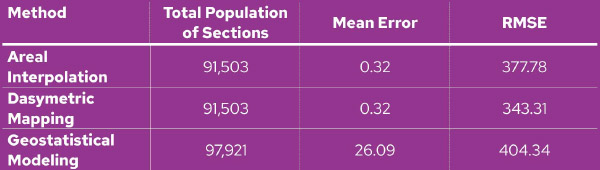
Table comparing the error characteristics of the three methods
A couple of points are apparent. First, geostatistical modeling breaks the property of plithyphylacticity. We have gained 6,418 people in Ozaukee County. Both areal interpolation and dasymetric mapping, however, return the correct total population of 91,503. Considering how these latter two methods reallocate population to the target zones, this is to be expected, since the areal weighting correctly ensures that the sum of the areal proportions for each tract sum up to 1.0. No population can be gained or lost. However, there is no such constraint associated with geostatistical modeling, and thus population gains or losses can occur.
Note that the mean error for the areal interpolation and dasymetric mapping methods in the table should both be zero. Since these methods preserve plithyphylacticity, over-estimation of the true population in one section must be balanced against the same amount of under-estimation in other sections. The reason that mean error is not zero is again the jitter introduced into block populations by the Census Bureau, which causes the total population by blocks to fall short of the total population by total sections.
A second point is that the geostatistical approach has the worst error parameters of the three methods. This presumably is because this method uses the centroid of each source zone to build a surface that is spatially autocorrected. It’s apparently not the case that population in Ozaukee County follows such a spatial distribution. There likely is autocorrelation, but the model is not capturing this accurately. Other model configurations with different parameters may resolve this problem somewhat, but that effort would take some trial and error.
Also note that the geostatistical method has a high mean error. This means that it tends to overestimate section populations. You can see this visually in the maps above. Map 4 (geostatistical model) has considerably more sections with a population density over 1,000 people per square mile. The histogram below shows that the geostatistical method produces a population distribution that has large numbers of both low- and high-population sections compared to the other two methods.
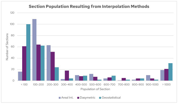
Histogram of section populations resulting from the interpolation methods
Of the three methods, dasymetric mapping had the best error parameters and so in that sense could be called “The Winner.” But this is of course subject to the caveats give above.
Conclusion
My purpose in this post is not to critique Esri or ArcGIS, but rather to call attention to the need to always dig deeper before accepting the results of any new GIS method. It may be convenient to simply implement an off-the-shelf tool and accept its results uncritically, but the results may not be what you expected. This applies, not only to software like ArcGIS, but also to open source tools and methods.
As the quotation at the head of this post says, it’s important to always “look under the hood” when doing any type of GIS analysis. You might think you have a nice new 16-valve dual overhead cam engine in your vehicle, only to realize too late that you have a lawnmower engine, a synchronous reluctance electric motor, or a V-16 salvaged from a Word War II fighter. Let the buyer beware.
Thank you to Mike Hasinoff for his thoughtful suggestions on an earlier draft of this post.