

CropScape screen shot
Editor’s (Veregin) Note: We’ve all used (or created) maps that show categories like land cover classes, climate types, vegetation types, soil classes, and so on. In many cases the number of categories is fairly small, perhaps on the order of ten or twenty. But for some phenomena, the number of categories is in the hundreds. This poses a cartographic challenge because of the difficulty of specifying hundreds of unique map colors that are easily distinguishable, evoke appropriate connotative meanings, and work equally well on a computer screen or a printed map.
An example of this kind of map is CropScape, an online viewer for the US Department of Agriculture (USDA) Cropland Data Layer (CDL) product.1 The CDL dataset covers the conterminous United States, and contains 133 unique categories, most of which are specific crop types (including specialized crops like pomegranates, triticale, and vetch). The dataset is updated annually based on a variety of remote sensing inputs. It is in the public domain and can be freely used and distributed.
CropScape allows users to map CDL data going back as far as 1997 (for some states), perform queries and change analysis, generate crop acreage statistics and hard-copy maps, and download TIFFs or KMLs for an area of interest. CropScape was developed by NASS and a group at George Mason University; this group also developed services for Web application development.2
Lee Ebinger, a cartographer with the USDA, was responsible for designing the CropScape/CDL color palette. I asked Lee to provide some commentary on the approach that was used. As she describes below, the problem is quite complex. Not only do the colors need to be distinguishable, but they need to work on different types of display devices and on maps of different scales. As such, Lee had to consider which crops grow in close proximity to each other, the sizes and spatial distributions of typical agricultural fields, and how these patterns would change as a function of map scale. On top of this, colors had to be connotative (“meaningful”) and be organized visually into logical groupings.
I think Lee would be the first to admit that the color selection for CropScape is not perfect, and that the design constraints posed some real challenges. As she stated to me, “It took a long time to select the colors (two to three months) and the time seemed to grow exponentially longer as each color was added.” Below, Lee describes some of the factors she had to consider when selecting colors, and the decisions that were reached.
We recently made an effort to standardize nationally all 133 categories and 60 colors across all years for the Cropland Data Layer (CDL). The final RGB (Red-Green-Blue) values for all of the categories can be found here. Selecting colors for the CDL was a process that took several months to complete. In addition to accounting for the large number of crop types, we had a number of criteria that needed to be met.
1) The colors had to be distinguishable in RGB for screen display and in CMYK (Cyan-Magenta-Yellow-Black) for printing on our HP 5500ps Designjet plotter (6 dye-based inks). I tested plotting many different colors. Plotters have different color management systems and algorithms for converting from RGB to CMYK color models, and the type of ink and medium also affect how the colors appear. To complicate matters, we purchased a new HP Z6100ps Designjet plotter (8 pigment-based inks) after the initial color selection. The colors on this plotter look quite different from those on the HP5500ps, so a few colors were adjusted to accommodate the new plotter. Of course, we have no control over what kinds of plotters are being used by people who download the data, so some colors are just going to be harder to distinguish. We anticipate that some users will tweak the colors for their own display and printing needs.
2) I decided to prioritize based on crop acreage in the entire country, and used saturated colors to emphasize the major commodities. I initially specified colors for crops in states for which we generated CDL data (Midwest, Central Plains, Mississippi Delta) and added colors as we completed CDLs for additional states. I also selected extra colors which are optionally used for states that have a large number of specialty crops. I created some custom colors and utilized colors available from Esri ArcGIS color styles.
3) I had to consider which crops grow adjacent to each other. This is important for colors that are juxtaposed and appear to form some other color at small map scales. For example, I chose gold for corn and dark green for soybeans (in the Midwest these two crops often grow in close proximity) so that when viewed at a small scale the colors do not blend together. There is still some work to be done on this. For example, we did not produce CDL data for the northwestern states when I first selected colors, so I was not able to account for crop types that are adjacent to each other in this region. Another example is winter wheat/soybeans which is the only double-cropped category symbolized with a unique color (dark olive). This color is midway between the colors used for winter wheat (medium brown) and soybeans (dark green). At first, I thought dark olive was an appropriate color, but I later realized it is sometimes hard to distinguish from the dark green color of soybeans when the crops are grown in the same locale.
4) I tried to use related colors for similar crops that may be grown in separate regions, e.g., light brown for spring wheat (Northern Plains, Northwest), medium brown for winter wheat (Southern Plains), and dark brown for durum wheat (Northern Plains). I also used a common color family for various types of small grains.
5) Most crops are green and using many green colors would be impractical and not easy to discern, so if the crop produced a fruit or flower, I sometimes selected colors based on that. At other times I considered growing conditions. Examples include blues for rice (flooded fields), aquaculture (water), blueberries (fruit), and flaxseed (flower). Some crops do not look anything like the color selected. For example, sugarcane and sugar beets are purple and were chosen for visual separation. Likewise cotton is red to distinguish it from other saturated crop colors in the Mississippi Delta. An off-white color for cotton would have been difficult to discern from Texas grassland.
6) Minor crop categories – specific vegetables, fruits, nuts, etc. – were assigned a common color corresponding to general categories such as miscellaneous vegetables and fruits, other crops, other small grains, and other tree crops.
7) The non-agricultural category colors were selected to be similar to the colors used in the National Land Cover Database (NLCD)3. They are less saturated, so they visually recede into the background compared to the more saturated crop colors in the foreground.
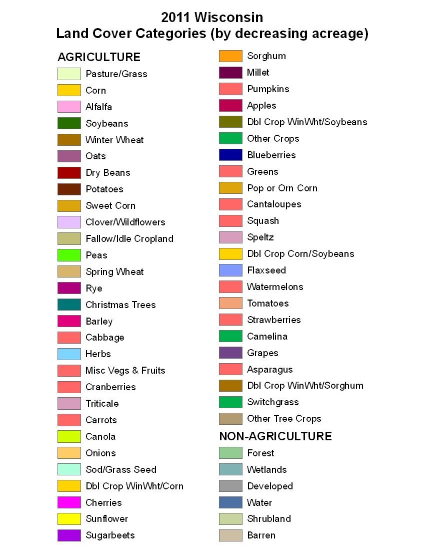
For our printed maps – available with the CDL files downloaded from the Data Gateway – we use a customized legend that displays the crops by decreasing pixel count which is proportional to acreage, so that the largest categories within the mapped region are listed first. This helps the map reader identify the most predominant categories, in case of confusion with other similar crop colors that have fewer pixels. The version of the Wisconsin CDL legend for 2011 is here. It shows all of Wisconsin’s 2011 CDL agricultural categories. However, Wisconsin’s non-agricultural categories have been combined into common categories in the legend.
Another, even more challenging, cartographic problem I was faced with is this: How to display only the categories that are visible on printed maps of a specific scale. Map scale and viewing distance are just two considerations for determining map legibility. Map scale is determined by the paper size and dimensions of the mapped region. Viewing distance is assumed to be 1-2 feet (farmers closely inspect the map to see their fields). In the case of CDL maps, a visually discernible crop field has a minimum area on the map at a given scale, and a crop category with many barely visible fields has a minimum aggregate area on the map at a given scale. Note that the shape of the area (field compactness) is not taken into consideration.
I considered three options for generalizing raster images – thematic resampling, generalization, and recoding – to ensure the map categories are legible. Thematic resampling can produce a lower resolution image (larger pixel size) and uses a nearest neighbor algorithm to assign a value to a pixel. (Note that plotters use nearest neighbor or a similar algorithm to output an image at the plotter’s resolution). The NLCD Smart Eliminate tool4 applies an aggregation algorithm which generalizes clumps of pixels below a minimum mapping unit (MMU) by reclassifying (recoding) the clump to a neighboring class; inputs are the MMU and a weight file specifying replacement classes. Recoding simply reassigns a different category code to a pixel, thus changing its category and in effect combining categories together.
I decided to utilize the Smart Eliminate tool and a separate recoding procedure I developed to reassign category codes of smaller-acreage crops to related larger-acreage crops. This offered me the most control over the final image. With Smart Eliminate, I generalized very small clumps and did not use weights; this serves to smooth the data. I applied a small MMU of four 30-meter pixels or a MMU of two 56-meter pixels to generalize crop categories and non-linear categories (not representative of linear features such as roads, beaches, or rivers). I did not generalize categories that potentially represent linear features. No weights means a small clump is reclassified to a neighboring class that has the most pixels.
I developed a simple automated recoding model (in Erdas/Imagine and ArcGIS) that, after generalizing the data, combines certain categories together for a given map scale. I first devised a matrix of which crop categories recode to other crop categories at certain steps in the model. The model recodes single crop/non-crop categories that share a common color to a general category, and recodes double-crop categories (except winter wheat/soybeans) to the larger of the two single-crop categories. The model then iteratively recodes smaller specific categories to related larger categories based on the minimum areal size of a crop’s aggregated pixels (1/4, 1/2, or 1 square map inch) and the minimum areal size of the largest pixel “clump” – i.e., a group of adjacent pixels with the same crop type – (1/20, 1/10, or 1/4 square map inch). The output images at various map scales were reviewed for legibility and the model parameters were recorded in a dBase file for use in the model.
The model ensures that very small categories not discernible at the specified map scale are combined with larger categories. This makes smaller-scale maps more legible and reduces the number of crop categories listed in the legend. The model takes time to execute; however, it standardizes the recoding process and provides better control over the output image, rather than relying on the output device or a generic resampling algorithm. The Smart Eliminate tool offers a lot of flexibility, but it is not quite what I required. The model is not perfect – for example it does not completely account for diffused “buckshot” crop pixels, nearby fields (pixel clumps) that visually cluster, the shape of a field (compactness), or the color difference between adjacent pixels. Those are topics for future research.
The maps produced by CropScape are dynamically created and do not recode CDL categories. They display the top 16 agricultural categories and the top 6 non-agricultural categories prioritized by acreage (pixel count).
I’m very interested in feedback from users and from other cartographers. Please send me an email if you have a question or comment.
References: Cropland Data Layer
1. Boryan, C., Yang, Z., Mueller, R., Craig, M., 2011. Monitoring US agriculture: the US Department of Agriculture, National Agricultural Statistics Service, Cropland Data Layer Program. Geocarto International, 26(5), 341–358.
2. Han, W., Yang, Z., Di, L., Mueller, R., 2012. CropScape: A Web service based application for exploring and disseminating US conterminous geospatial cropland data products for decision support. Computers and Electronics in Agriculture, 84, 111–123.
3. Fry, J., Xian, G., Jin, S., Dewitz, J., Homer, C., Yang, L., Barnes, C., Herold, N., and Wickham, J., 2011. Completion of the 2006 National Land Cover Database for the Conterminous United States, Photogrammetric Enginnering and Remote Sensing, Vol. 77(9):858-864.
4. MDA Federal Inc. 2006. NLCD Mapping Tool User’s Guide. Rockville, April 2006.
Lee Ebinger is a cartographer with the USDA, Statistical Services Division. She has worked as a cartographer, programmer, systems engineer and IT specialist in the federal government and as a government contractor. She is also an adjunct associate professor at Northern Virginia Community College where she teaches GIS and cartography.